Artwork Guidelines
Tips for Preparing Print-Ready Files for Your Custom Packaging
To help you achieve the best results with your custom box design,
we’ve outlined a few essential guidelines for preparing and
submitting your artwork. Following these recommendations ensures
your packaging turns out just as you imagined—sharp, vibrant, and
professional.
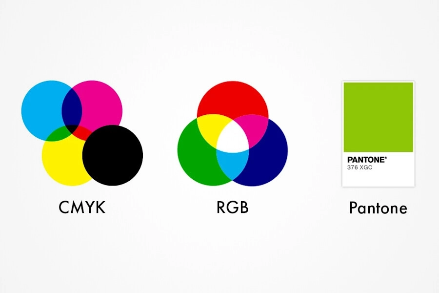
Color Mode
For accurate color reproduction, always design your artwork in
the correct color mode:
- CMYK is ideal for full-color printing.
-
Pantone spot colors are recommended when
color precision is essential. Avoid using RGB, as it’s
intended for digital screens and may not print accurately.
Fonts & Text
-
Use fonts larger than 9pt to ensure readability on printed
packaging.
-
Intricate or decorative fonts (like cursive styles) may lose
clarity when printed, even if they appear sharp on screen.
-
Always prioritize clean and legible typography to maintain a
professional look in print.
Resolution
-
Your artwork should be at least 300 DPI (dots per inch).
-
Lower-resolution images may appear blurry or pixelated once
printed.
-
High-resolution artwork ensures sharp edges, clear text, and
vibrant images.
File Formats
Submit your artwork in one of the following high-resolution,
print-ready formats:
-
PDF, TIFF, or EPS – Best for preserving
quality and vector elements.
-
JPEG or PNG (300 DPI only) – Acceptable for
non-vector graphics like photos. Avoid low-resolution or
web-optimized files when preparing print artwork.
File Organization
-
Keep your artwork well-organized using layers and clear
labels.
-
Name files and layers logically (e.g., “Logo_FrontPanel” or
“Background_ColorLayer”) to help avoid errors during the
printing process.
-
A structured file ensures a smoother workflow and accurate
final output.